
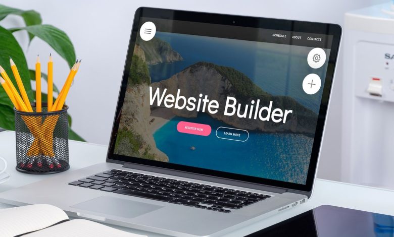
Obviously, your website should be modern and appealing, and an excellent design should excite your visitors. But be cautious: don’t merely follow one trend after another! After all, conventions with a zealous following aren’t always worth attending…
We looked around and compiled a list of the most bothersome web design trends now in use to keep your website free of the tiny things in design and usability that often appear unusual to your visitors.
Preloaders
You click on a page, get all psyched about the stuff you’re about to learn, and get a small spinning wheel as a reward. Perhaps a loading bar, small leaping dots, or something else that harkens back to the glory days of flash-based websites: Loading… It also happens after each and every click.
Why this exists: Complex web sites with photos, movies, and fancy JavaScript effects can all be presented at the same time.
Annoying wait times are one of the unintended outcomes. Shortening your wait times is a crucial feature of search engine optimization, and Google is particularly strict in this area. Preloaders, it turns out, can assist you enhance your page speed rating. Visitors to your website could care less — they don’t want to be kept waiting without seeing any progress.
As a result, conversion rates are low, and visitors are frustrated.
Pop-Ups that are abrasive
After arriving at the place, they appear out of nowhere, like a Jack-in-the-Box: Pop-ups. Even if you’re in the middle of reading something, or even after you leave the site, a pop-up may appear and block your path.
Why does this exist? Many websites would love for you to sign up for anything (like a newsletter) or like their Facebook page. However, such pop-ups frequently appear far too soon, before you have even had a chance to read a single word.
The unintended implications are particularly vexing. Pop-ups like this frequently cover the entire page or vital content, and you’ll be even more frustrated if you consider a smaller smartphone screen. You’ll have to go hunting for the button to close the pop-up, which, if nothing else, will detract from the enjoyment of the visit. After all, every user will always locate one button: the one that closes the window completely.
This resulted in low conversion rates and, in some cases, a tarnished brand. Here’s a hilarious list of terrible examples.
(OK, we’ll confess it: on some of the pages of this website, we use a pop-up.) It only appears when you leave the site; it is never displayed on mobile devices, and if you close it, it will not appear again for the next 30 days.)
Notifications by Push
They are pop-ups’ wicked twin brother (and often appear alongside). Push alerts, as if the pop-up wasn’t unpleasant enough, take it one step further.
Why it exists: It’s a simple and direct way to deliver information to your screen, comparable to app alerts.
If you accept to get them, they will follow you around even after you’ve left the website, bugging you whenever the marketing team feels it’s appropriate (which usually is never).
As a result, you will never accept them and will no longer trust the websites that offer them.
Menus for Hamburgers
You’ll be familiar with the hamburger menu if you’re using a mobile device: The three horizontal lines in the display’s upper left corner. When you tap these lines, the navigation area will appear.
Why is this necessary: On mobile devices, when space is at a premium, hamburger menus make sense.
The unintended implications are as follows: Nowadays, typical desktop websites get the hamburger menu treatment, which confuses visitors because key navigation elements like contact information, prices, and opening hours aren’t instantly available.
As a result, critical information is buried, and user engagement declines as a result.
Captchas that are difficult to solve
Even though you’ve dressed well and behaved perfectly, the bouncer gets in your face and says, “You’re not getting in here!”
Captchas that you can’t read are the same way. Is that a one, a seven, a six, or a capital G? You’ll get the same response no matter what you do: “You’re not getting in here!”
Why are captchas used? Captchas are a good line of defense against spam and bots, as any website owner knows.
Many Captchas are difficult to read or do not work, which is an unwelcome effect.
As a result, rather from protecting you from spam, these Captchas protect you from people you would wish to welcome to your site. Visitors, on the other hand, will not go for it; instead, they will leave your page and possibly leave an irritated comment on your company’s Facebook page.
You’ve definitely encountered some really egregious cases, so here are two approaches to dealing with bots and spam that are more user-friendly: Akismet, reCaptcha
Infinite Scrolling is a feature that allows you to scroll indefinitely.
And then you get to scroll some more, and then some more, and it never seems to end – no matter how much you’ve read, there’s always more coming up from below! Take a chance and give it a shot.
Why is this necessary: Infinite scrolling is supposed to (and does) improve readability, and it’s especially useful for mobile users — the fewer little buttons a mobile user has to hit, the better.
The unintended effects include that information typically seen in the footer may as well not exist. This is especially problematic when the footer has a login or contact information.
As a result, the footer is rendered worthless, yet it must still be loaded. Your visitors will find your information and features to be useless.
Other Controversial Web Design Trends
Sticky headers keep the menu structure visible and scroll with the rest of the site. This is supposed to make it easier to navigate. When you add a cookie warning to the mix, though, a lot of content can be hidden — especially on mobile devices.
Source: website builder